Visualizing programmer behaviour on StackOverflow - part 1
StackOverflow is widely known among programmers as a Q&A website where programmers can ask questions about nearly any topic related to programming. Over the years, it has become a popular platform for programmers to share their coding problems with the community, in the hope that someone either knows the answer or can provide some insights into the problem. StackOverflow has been around since 2008 and in the meantime it has accumulated a large user base. Due to its sheer size, new users can ask questions on a wide range of topics and obtain a first reply in a matter of hours. Battle hardened programmers, specialized around a certain technology stack, help new users with their questions.
StackOverflow does not rely on a select few with the power to create content. While entrusting content creation to a small pool of people would guarantee the creation of quality content, it would also result in limited scalability for the website and making it unfriendly for new users. The StackOverflow model instead is to a large extent community driven, that is, it allows anyone to create new content, may that be questions or answers, which results in a website more scalable and appealing to new users with a community that renews itself over time. The StackOverflow model is quite similar to the one used by Wikipedia, and in fact both websites use CC-BY-SA to license their textual content(with some notable exceptions for content like source code or quotations).
Stack Exchange data dumps
Stack Exchange, the organization behind stackoverflow.com and who also runs similar websites such as math.stackexchange.com and superuser.com, releases all user contributed data openly available for anyone to use and experiment on under the terms of CC-BY-SA. The data dump is hosted on archive, and provided there is enough disk space available locally, a copy can be downloaded in XML format. Given the dynamic nature of the content, releases are provided every three months, containing all user contributed data in the form of questions and answers up to the date of the latest data release. At the time of writing the latest release is from March 2018. If you wish to learn more information about Stack Exchange’s data dumps I recommend you do it here and here.
For the purposes of this blog post, I will take the publicly available StackOverflow data, create helpful visualizations of that data using tools from the Python ecosystem and then draw insights from the obtained results. I will try to analyse the data contained in the data dump from different angles and hopefully learn something along the way as well. I downloaded the XML files from archive, totaling around 60 GBs of XML data. I wrote a Python script to parse the XML files and import the data into a SQLite database, which worked just fine for my requirements, keeping just the necessary tables and fields to be used for my analysis. After importing the data into a relational database, another Python script reads the data and produces image plots, which can be more easily interpreted by humans than raw data stored in a database. The plots were created using Python packages Pandas and Seaborn.
StackOverflow across languages
Most people may only be familiar with English StackOverflow, however StackOverflow is available in five different languages.
Those languages are in order of their relative size English, Russian, Portuguese, Spanish and Japanese(or abbreviated with their ISO codes En, Ru, Pt, Es, Ja).
We may be interested in asking how do the different languages compare across different metrics such as the total number of questions, answers and users.
Due to the sheer size of English StackOverflow, the first plot shows the metrics for all languages including English, while the second plot includes the remaining languages but excludes English.
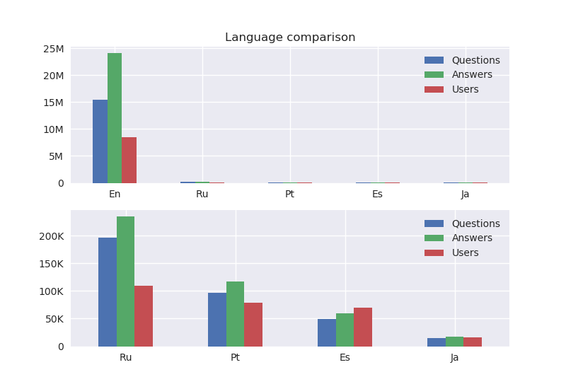
Perhaps unsurprisingly the first plot shows that English StackOverflow completely dwarfs all other languages. Ever since it launched in 2008 it has accumulated 15M questions, 24M answers and 8M users(pretty sure it qualifies as Big Data). Russian is the second most common language in StackOverflow after English, then followed by Portuguese(never underestimate the online presence of Brasilians). Interestingly enough Spanish StackOverflow has more users than either questions or answers, could it be that a large number of people create user accounts but either never come back or don’t really post anything on the website? As a final remark, looking at the Y axis for both plots shows that English StackOverflow is two orders of magnitude larger compared to any other language.
Evolution of StackOverflow
Let’s focus on English StackOverflow for now.
We know the total number of questions, answers and users but how exactly have those metrics evolved through time?
The X axis shows the time dimension beginning on August 2008, the date when StackOverflow started operating, all the way until March 2018, the date of the latest data dump.
The Y axis shows the metric value per day, as an example from the plot on January 2012 there were about 4000 questions and 7500 answers being posted per day.
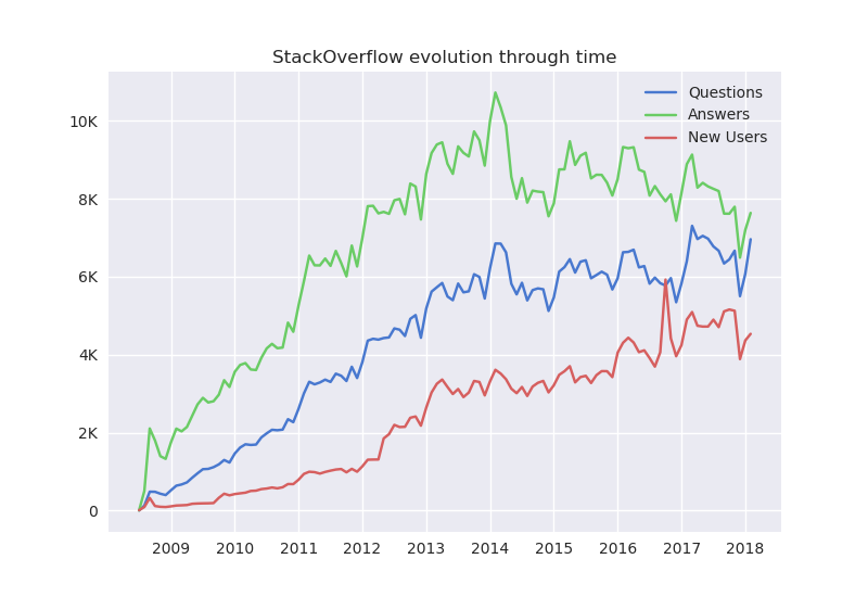
The information from the plot shows that variables are in fact correlated. A spike/drop in one variable is often followed by a spike/drop in another variable. Intuitively this makes sense, since more users leads to more questions, which in turn leads to more answers and so on(this is obviously an oversimplification since there are extra factors at play here). The initial 3-4 years mark the adoption phase for StackOverflow, a period of exponential growth where the number of questions and answers per day doubled every 1.5 or 2 years, essentially Moore’s law applied to StackOverflow. As an example, in January 2010 StackOverflow hadn’t yet achieved 2000 questions and 4000 answers per day, then in early 2012 questions doubled to 4000 per day and answers were well on their way to 8000 per day. Then in early 2014 came a peak for answers with nearly 11000 answers being posted per day.
Popular tags and their evolution
Something particularly interesting about questions is that they have tags associated with them.
Tags are labels that identify the scope of the question, for example C++ or Python.
Whenever a user posts a question on StackOverflow he has to label it accordingly so that other users can find the question more easily.
For example if you are an expert in C++ and you want to help other users you can search for questions being posted with the tag C++.
We can look at the 10 most popular tags, or in other words the tags which have the most questions asked.
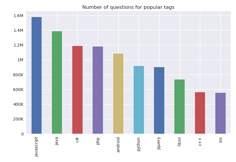
JavaScript takes the top spot with nearly 1.6M questions asked, followed by Java with 1.4M.
Somewhat surprisingly, C# takes the 3rd spot, being almost on par with PHP.
Similar to the previous plot tracking StackOverflow’s evolution, we can plot how tag popularity has evolved through time.
A particularly successful plot to display this information is to use a stacked area chart, where the amount of area corresponds to the number of questions being asked with that specific tag at a particular period of time.
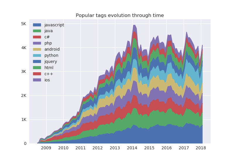
We can infer from the plot that C# was in fact quite strong in StackOverflow’s early years, looking for example at 2010 and 2011, a sizable chunk of questions were asked with the tag C# in them. Other tags like JavaScript and Java gradually took away the “dominance” of C#. It’s also interesting to see that Android grew from almost nothing in 2009 and 2010 to quite a sizeable community from 2011 and beyond. In fact the original Android launched in 2008 around the same time as StackOverflow and so the initial years of StackOverflow also marked the initial adoption phase for Android(this was of course before Android took over the world as the de facto mobile operating system). Python has registered an increase in the number of questions in 2017, likely for increasingly being prefered as the language of Data Science and applied Machine Learning, a trend that is likely to continue as the demand for those jobs further grows. jQuery is not as strong as it used to be, having suffered a decline in usage in the last quarter of 2017 and early 2018. I shall not make any comments regarding “JQuery is dead”, however the landscape for web development is constantly shifting, resulting in older, well established frameworks to gradually lose their user base as new standards and frameworks get developed and later adopted.
Tag usage patterns and tag co-occurrences
So now we know which tags are the most popular and how their popularity has evolved through time.
We can still further explore the information contained in the tags.
Since questions can be tagged with multiple tags, we can explore how many tags are typically used whenever users ask questions.
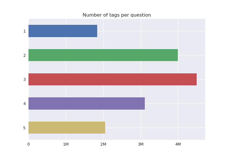
The most common option for tagging questions is to use either two or three tags per question. As an example, one tag could be about the programming language(e.g: Java), while another tag could be about a specific library/framework for that programming language(e.g: Spring, Swing) or about a language feature(e.g: arrays, garbage collector). On the extremes, users tend to avoid using only one tag, as it likely does not contain enough specific information, or even using five tags, likely due to exploiting way too much information.
We already know that tags are typically not used in isolation, as we have just seen it is fairly common to use either two or three tags per question.
Another question that arises naturally from this observation is to explore tag co-occurrences, that is, if tags don’t typically occur in isolation then it is interesting to know which are the tags that appear together in context with some other tags.
As an example, for a question with the tags Python, NumPy and Pandas, the following pairs of co-occurrences each count once: Python<>NumPy, Python<>Pandas and NumPy<>Pandas.
I shall be counting tag co-occurrences for all the questions contained in the data dump, showing co-occurrence counts for the popular tags from before, where each color/subplot displays one of the popular tags and the bars display the tags that co-occur the most with that particular tag.
Please bear with me as the following plot is a bit long.
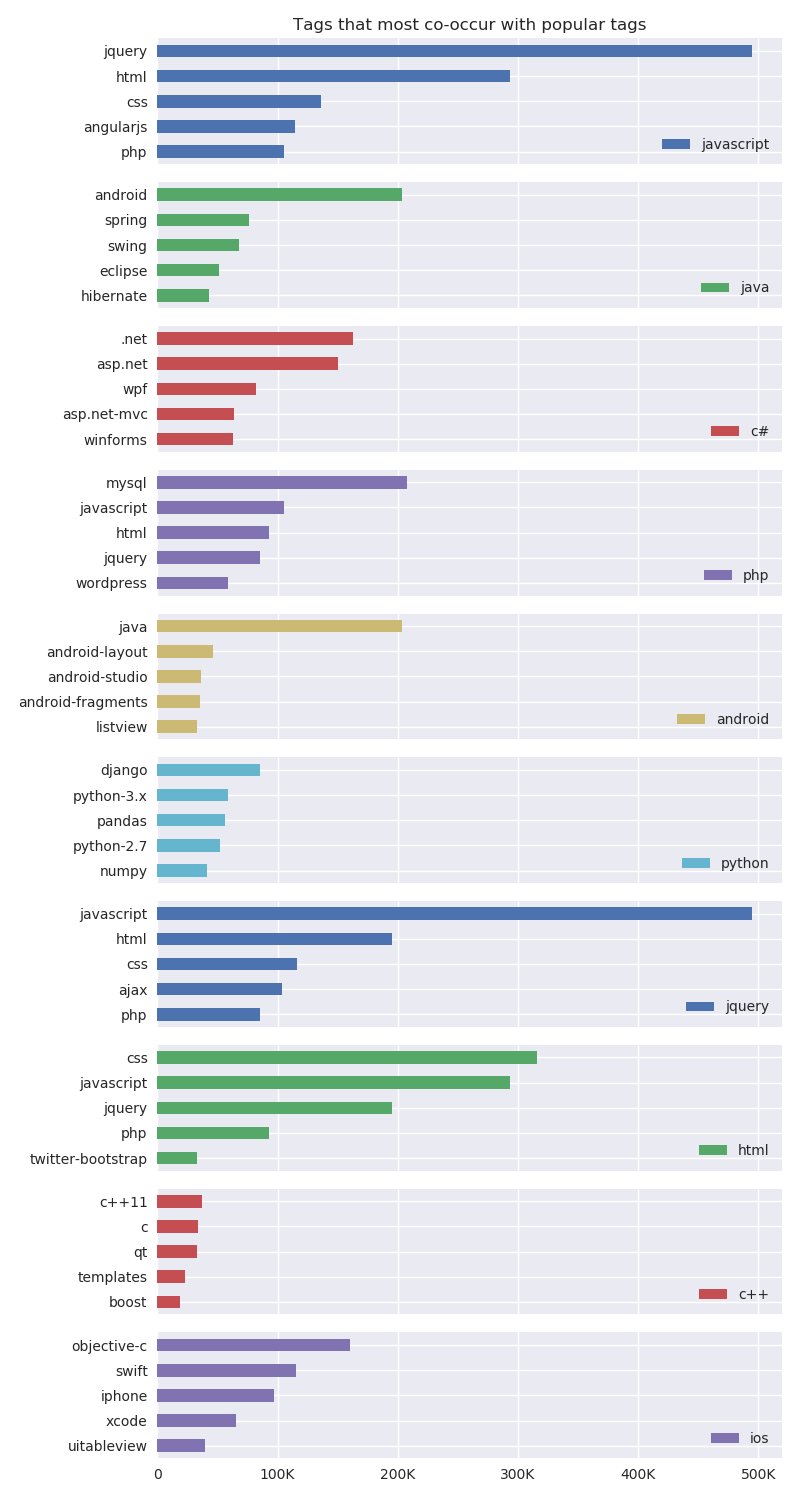
The resulting co-occurrences actually make a lot of sense. The languages for web development: HTML, CSS, JavaScript, jQuery, etc., co-occur quite often, meaning that if a user tags a question with jQuery then other tags such as JavaScript, HTML or CSS are also likely to be used. Java most commonly occurs in the context of Android, even more so than in the context of Spring or Swing. C# appears often with other technologies developed by Microsoft like .net or asp.net. iOS also has its own ecosystem and appears in the context of Objective-C, Swift, iPhone, etc. These results bring up the notion of technology stacks, a combination of languages used to achieve a common purpose like building a web or mobile app. In such cases it is normal, or even expected, for a programmer to have experience with the set of languages that constitute the technology stack. In the context of StackOverflow, this means that users who tend to ask questions from one language of a certain technology stack are also likely to ask questions about other languages from the same technology stack.
Number of answers per question
So far we still haven’t explored the information about answers.
In order to get a better sense of how answers are distributed we can try to plot the number of answers per question.
Questions with more than 5 answers have been aggregated into a single label, being displayed on the plot as 5+.
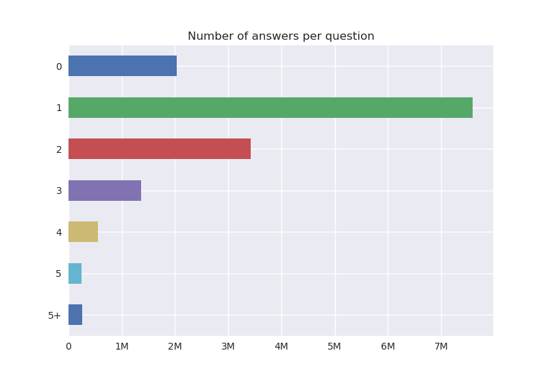
It is fairly clear from the plot that questions with few answers are considerably more common than questions with several answers.
In total, there are 7.6M questions with just one answer, 3.4M questions with 2 answers and 2M questions without answers.
We can further explore whether the distribution of answers varies for different tags, specifically, we shall consider our popular tags from before and plot the distribution of answers for each popular tag.
The following plot will be quite similar to the long plot from before where instead of tag co-occurrences we are looking at the number of answers per question.
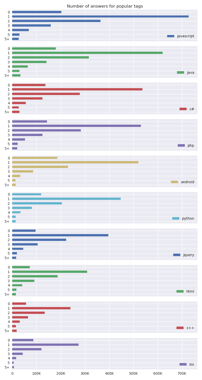
Interestingly enough, the shape of the distribution is roughly the same for all the popular tags and matches the shape from the previous plot which was taking into account all the questions.
The relative size varies from tag to tag however, as some tags have more questions than others.
With that in mind, we can attempt to estimate a continuous distribution from our discrete samples(number of answers).
A popular method to do so is Kernel Density Estimation(KDE), which is a non-parametric approach to density estimation that operates by placing a kernel function, most commonly a Gaussian distribution but there are several options for kernels, centered on each data point.
Using the example of Gaussian kernels, after each datapoint gets its own Gaussian, we then add all the Gaussians together and normalize the distribution so that the area under the curve sums to 1, yielding a valid probability distribution.
This is in stark contrast to a parametric approach, which would try to fit a known distribution, commonly a Gaussian or a mixture of Gaussians, to the data through Maximum Likelihood.
The next plot is the result of applying KDE estimation with Gaussian kernels to the histogram data of the previous plot.
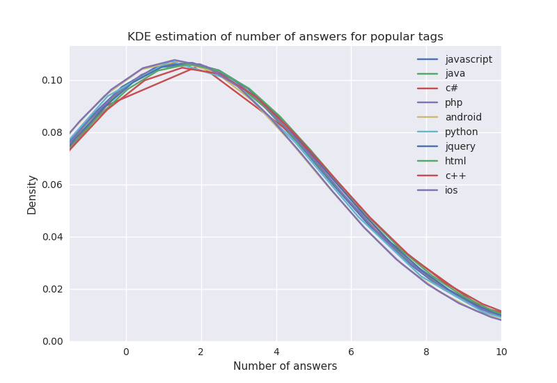
The shape for each tag resembles the familiar bell shape curve, perhaps more importantly the distributions are very similar to each other, which is a strong indicator that the underlying factors governing the distribution of answers do not depend on the tags that question was asked with, this is true for the most popular tags but it might not be true for other less known tags. In other words, by knowing the tags a question was asked with, if we had to predict the number of answers that question would have then knowing the tags would not fundamentally change our prediction. Other factors are likely more predictive of the distribution of answers, like the profile of the user who asked the question, the day of the week the question was posted, the particular way the question is formulated, etc.
Conclusion
On this blog post I took the publicly available StackOverflow data and created visualizations diving into key aspects of the available data. In order to do that I used plotting libraries and tools for data analysis from the Python ecosystem. As this initial blog post was becoming too long, I decided to release any extra results I could obtain in a second part blog post since there is still enough room left for additional exploration. Although I have created plots for the five languages mentioned at the beginning, due to lack of space, I could not include plots for other languages other than English in this blog post. As a result, I have released all the plots from my experiments on GitHub, together with the code required to import the data and create the plots, which can be accessed here. A part 2 blog post will become available soon.